Showing posts with label Curious Art Lab. Show all posts

Monday, September 26, 2011

Z is for Zebra

Alas, all good things must come to an end. This is the final entry for Ben Towle's Animal Alphabet. Sob!

I have a feeling these red envelopes are also an endangered species. (See more Netflix doodles here... while they last.)

Black rollerball & white gel pen on Netflix return envelope.

p.s. It helps if you pronounce the "Z" in British fashion, i.e. "zed."

p.p.s. Can you find the hidden message? (Click if you need a closer view.)


Sunday, July 24, 2011

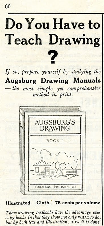
Brain Medicine & Drawing Instruction

Despite temps nearing 100 & rain threatening, I had a splendid morning at the Fleam: I found some great old textbooks & ephemera for cheap, as well as a handsome Visible Man model with at least most of his dainty little parts intact.

These ads are both from Primary Education magazine, January 1923.

I imagine being forced to teach drawing does sometimes result in dreadful mental strain. That's probably why the arts are disappearing from our schools, right? So maybe we just need to bring back Horsford's.

Monday, July 11, 2011

O is for Octopus

... & obvious. I admit I cheated a bit on this weeks entry for Ben Towle's Animal Alphabet, by using an old drawing, white gouache on black paper, retweaked a bit in Photoshop.

Monday, June 6, 2011

J is for Jaguarundi

Ben Towle, the creator of the wonderful web comic Oyster War, also runs a weekly challenge called The Animal Alphabet Project. I'm a bit late to the party, but I do love drawing beasties, so here's my first contribution.

J is for jaguarundi.

Ball-point pen, marker & white gouache on brown paper, with a bit of Photoshop fiddling. ~6x7"


Saturday, May 28, 2011

Sleep Tight!

Beginning next month I will be taking a class in Flash animation. In preparation I've been working on ways to simplify my art style drastically, so as not to go entirely crazy when I have to do a whole bunch of drawings of the same subject. %} Here's one of my efforts, which is actually part of a quasi-animation test I did in Photoshop. Unfortunately, every time I try to export/render to video, it crashes my computer! So, for now, the still will have to do. (You're not missing much, I promise.)

I did the initial sketch in ink & white gouache on toned paper, then changed the color & added the background (scanned from an acrylic painting) in Photoshop.

Part of me really really wants to refine this, but I'm trying as hard as I can to let go of my obsessive tweaking since I know I won't have time for that in my class.

I do hope this creepy crawly fellow doesn't disturb your dreams.


Wednesday, April 6, 2011

iMad Scientist: Brushes iPad App Review

For the next few posts, I'll be reviewing my experiments with various iPad paint apps. I'd very much welcome comments, corrections & tips if you have experience with these apps, or any questions if you are looking into the subject yourself.

This image, "Toy", was created using Brushes with the Nomad Brush.

Brushes was the first mobile paint app, & thus has some intriguing history & many ardent users. The famed iPhone New Yorker covers were created on the iPhone version of this app.

Ease of Use
Brushes is quite straightforward & intuitive to use. It's responsive & quick. The tools, layers, photo albums, color palette, color picker & fill tool all remain visible on the toolbar. The entire toolbar can be "disappeared" with a tap (which is good when you want a full view of the art or if you tend to bump into the bottom toolbar) or kept visible for speedier operation. There are also several double-tap shortcuts that can help speed things up. There is quite a thorough downloadable user's guide, as well as a few useful app settings that can customize the app to your preferences.

Brushes
Oddly enough for an app called Brushes, the brush selection is possibly the app's WORST FEATURE. There is only one brush tool, & though it does have 19 options for brush shape, there are no additional texture options. Brush spacing & size can be adjusted, & there are settings to vary size or opacity with speed, but the latter are on an all-or-nothing toggle, & there is no minimum radius feature, so stroke control is quite limited. There is no smudge or blend tool, so blending is a bit tedious. The app does remember separate settings for eraser & brush at least, unlike some.

Layers

There are only six layers available, but the app does offer five blending effects in addition to the opacity setting. (I used multiply & screen in creating the image here.) Other features include merge-down, clear, duplicate, & a handy flip tool. There is no visibility toggle, though you can get around that by setting the transparency to zero.

Color
The color palette conveniently includes both swatches & sliders, visible at the same time. That's the way I set up my color palette in Photoshop so it was nice to have that option here. It's also possible to save custom colors, which is very useful. The one odd annoyance with color is that changing colors in the palette sets the transparency back to 100%. It would be nice to be able to turn that feature off. Using the color picker does retain transparency, luckily, or blending would be an even bigger hassle!

Imports
Brushes allows importing from saved photos or library, & on importing immediately opens a transform option for positioning the photo.

Saves & Exports
It is here that Brushes really shines, boasting a unique feature that automatically saves & replays every stroke. It's quite a kick to watch the painting in progress & it can actually provide some interesting insights into your workflow. It's even possible to export these actions via e-mail & convert them to a movie via a free program called Brushes Viewer. (Alas, this is only available for Mac.) Nonetheless, I vote the replay function as the hands-down BEST FEATURE of this app. There is also a very handy option to send your image directly to Flickr, as well as the usual e-mail & add-to-photos options.

Gallery
The gallery shows large images "framed" in "wood" against a gallery wall. A skinch gimmicky for my taste, but not too obtrusive. Tapping on the thumbnail icon opens a handy overview of your images. The label includes the date, which is nice, but also the unnecessary & possibly-inaccurate description "Digital Finger Painting". There seems to be a bit of a glitch in the orientation function, since it doesn't respond to the iPad's orientation.

Overall
Honestly, the action-replay function is the highlight of Brushes for me & makes it great fun & even a bit addictive. Otherwise, the limitations of the brush selection would probably keep me away.

You can find more iMad Scientist paintings & reviews here.

Wednesday, March 30, 2011

iMad Scientist: Procreate iPad App Review

For the next few posts, I'll be reviewing my experiments with various iPad paint apps. I'd very much welcome comments & tips if you have experience with these apps, or any questions if you are looking into the subject yourself.

This image, "Springy" was created using Procreate with the Nomad Brush. The spring diagrams in the background are from a vintage technical book, scanned & imported into photos. (Please click for a full-size view.)

This app has some very appealing characteristics, but in its current incarnation, it doesn't quite suit my style, as I'll explain below.

Ease of Use
By the time I picked up Procreate, I'd already worked with several apps, so I'm not sure how it would strike a newbie, but it seemed fairly straightforward to me, & the developers offer a very helpful pdf user's manual to help work out any mysteries. The app works smoothly with none of the lag I've experienced with some others, & from what I've heard, user support is unparalleled.
The undo/redo depth is outstanding, allowing for 100 levels! The non-interpolated 3200% zoom is easy to use, fast, & allows great precision. This is probably my second-favorite feature of the app.

Brushes
Procreate has 8 built-in brush shapes, & is unique among paint apps (as far as I know) in allowing the user to create or import custom brush shapes & textures. This goes not only for the brush per se but also erasers & smudge tools. This is without a doubt the app's BEST FEATURE & would make it a favorite for brushes if not for one serious limitation: there is no minimum radius adjustment, so creating a tapered, precisely shaped brushstroke is all but impossible. (There is the ability to adjust radius to speed, but only to a degree, & control is iffy.) Even if you don't use tapered brushstrokes, a minimum radius feature would be extremely useful for better eraser control. There are, however, interesting adjustment possibilities for texture scale & shape rotation, as well as scatter, fall-off & spacing.

Layers
The layers palette is unusually deep for an iPad app, allowing for a luxurious 16 layers. It's fairly easy to handle when it comes to merges (down OR up), reordering, clearing, transforming & duplicating layers.
Alas, it falls short in blending effects. Only opacity can be adjusted: no multiply or screen functions here. When I work in non-digital media I use a lot of glaze effects, so when working digitally I'm a huge fan of multiply, the digital equivalent of a dark glaze. That makes this limitation the app's WORST FEATURE as far as I'm concerned. Luckily, according to the developers, future upgrades may add blending effects, & in any case, if you are an alla prima type, their absence might not bother you at all.

Color
The palette offers a large color-chooser & HSB sliders. The palette is easily accessible & the tap-hold eyedropper feature works fairly reliably, though it seems it will only sample from the active layer. {Edit: Please see my comment below.} Unfortunately there doesn't seem to be a swatch palette, so it's not possible to save favorite colors.

Imports
Procreate allows you to import multiple images from your saved photos or photo library, & to flip these (as well as your working canvas) horizontally & vertically, in addition to scaling.

Saves & Exports
Auto-saves & also makes it easy to save the file or a copy of the file at will without much fuss. You can also duplicate the file in the gallery, or export via e-mail.

Gallery
The gallery is elegant & simple in design, with large images against a dark gray ground. You can really only see one image at a time, but it's fairly easy to scroll through.

Overall
I have high hopes for this app. It's the newest on the market & the developers seem extremely responsive. I have a feeling that in the future, with a few developer tweaks, it will become a favorite. Currently, though, it's not the dream app I'd hoped for.

You can find more iMad Scientist paintings & reviews here.

Friday, March 25, 2011

iMad Scientist: iPad App Painting Experiments

Tech-phobes beware: inspired by the IF prompt "Toy" I've decided it's finally time to put aside my ink-stained Luddite ways & share my thoughts about my favorite, magical new toy/torture device: the iPad. I received it as a surprise Christmas gift, for which I'm enormously grateful because I would never have bought one for myself, & now I'm completely addicted to this brilliant little package of wonders. It's the perfect size, just like a sketchbook, easy to use on lap, desk, or cafe table (even in bed-- & no paint spills! -though I try not to do that too often). It's not feather-weight, but still relatively easy to lug around, & full of possibilities.

Of course, one of the first things I did on Christmas Day (after recovering from my swoon when I opened the package) was to download a paint app & give it a go. Now I must warn you that in some ways, painting on the iPad is an exercise in frustration, especially for precision-freaks like me, because no matter how carefully you place your finger or stylus, & no matter which app or tool you use, there is always a 5mm floob-factor of where the mark will show up. (It reminds me of learning to drive on my folk's huge & ancient station wagon, when turning the steering wheel just sort of vaguely indicated where the car might go.) Takes some getting used to if you're a perfectionist, but with practice you can still accomplish quite a lot even with this limitation. And if your natural style is loose & free, this really shouldn't be an issue at all. Sorry I even brought it up, you lucky looseys! ;)

Another major frustration is the lack of pressure sensitivity. For artists used to the wonders of Wacom & super-sensitive programs like Photoshop & Manga Studio, it's quite a leap backwards. I nurse a fond hope that Apple will someday develop an iPad tweaked for artists, with greater precision & a pressure sensitive stylus. Despite my cheapskate ways & severe mall-phobia I think I might join the crowd waiting in line for that one!

But in the meantime, I refuse to let a little frustration stop me from experimenting with new art tools & new tricks-- it's just part of the learning process, right? So I've been downloading paint apps one after the other, in search of the optimal iPad paint experience. So far, while each app has its good features (some quite amazingly good) I still haven't found that one perfect app that does everything just the way I like it. (Greedy, moi?)

By contrast, I've also done some stylus exploration, & here I've found a clear, hands-down, knock-out-the-competition favorite-- the Nomad Brush. It is surprisingly beautiful, handles like a real paintbrush, moves with a silky smooth touch on the pad surface (unlike some pen-type styli that have an irritating rubbery drag factor or require excessive pressure) & can be held at any comfortable angle (again unlike many pen-type styli). For now it only comes in one size, but I eagerly await the developers' promised size & bristle variations-- of course the inherent limitations of the iPad again come into play here, but a smaller brush might still be nice for greater stroke visibility & somewhat improved precision.

I still feel like a rank beginner at this & have been very shy of sharing my wobbly efforts, but I think the time has come to be brave. So. The image above was created with the Brushes app, using my fingers & the Nomad Brush. The background texture & text were imported from scans of non-digital stuff, saved to my iPad photos, opened by Brushes & used as the base layers. All blending, layer effects & such were done on the iPad.

Next post: I will begin sharing my experiences with all of the different paint apps I've tried, comparing features, offering tips &c. If you thought this post was tedious & long-winded, gird your loins for a real verbal onslaught, folks! But I hope it will be full of info that will help you avoid frustration & wasted money if you want to make art on the iPad.

You can find more iMad Scientist paintings & reviews here.

edit: Just found out "Toy" was added to the Nomad Brush Gallery! Thanks, Nomads!

Friday, February 18, 2011

Winehound

And now for something completely different! In honor of National Drink Wine Day* (or actually in defiance of it, since this was an unauthorized use) I had the notion to do a little sketch using wine as a medium. It was a new experience for me (though I have painted with coffee before). I used some cheap Cabernet Sauvignon on Bristol board, applied with a 10x0 watercolor brush. (The image is roughly 4x5".) The wine right out of the bottle gave a pale grey-violet effect. I wanted to be able to darken some areas, so I tried condensing it for a bit in the microwave. Interestingly, this not only darkened & thickened the "ink" but also caused it to retain its original reddish color, at least long enough for a scan. Further experiments are in order, but first I must answer my country's call & drink some of this stuff. Cheers!

*Thanks to the ever-inspiring Allison Sommers for alerting me to this vitally important national event.

Monday, February 14, 2011

Warmheart

I've been experimenting with sketching quick little characters (who may eventually be animated!!) & this one seemed appropriate for today. I always liked the saying "cold hands, warm heart" (maybe because my hands are often cold), so this week's IF prompt made me think of dressing a little heart guy up in a nice warm sweater.

Brush marker, ball-point pen, & white gouache on cut-out brown paper, about 3x4"

Happy Valentine's Day!

Sunday, January 30, 2011

Nightmare

I can hardly believe it, but I'm nearly finished with the book! Not quite though, because I'm a crazed tweaker. It's especially hard to let go of a series, because whenever I look back at a piece with fresh eyes I always see something I want to change! But at some point you just have to surrender.

In this image the old man is dreaming of the black cat, & fearing for his magic flute.

Acrylic on text & maps on canvas, 9x12".
Click for a closer view & to find the hidden cat.

For The Old Man and the Cat, by Anthony Holcroft, to be published in 2011 by Penguin NZ.

Sunday, November 28, 2010

Fleam Find

I'm so lucky that I live just down the street from the amazing Raleigh Flea Market. I can't resist the Fleam-- you never know what wonders (&/or weirdness) you'll find there. Today there was an especially nice book stall with many antiquarian delights, most at bargain prices.

This is a detail from the cover of my find of the day-- a 1855 volume, edited by one Dionysius Lardner, D.C.L.-- full of tidbits about everything from "The Brain of the Ourang-Outang" & "The Sagacity of Bears" to "Magnifying Glasses for Miniature Painters." Dozens of engravings to boot.

All for a fiver! Squee!

Friday, November 26, 2010

Food & Warmth

Yet another illustration-in-progress from the book I'm working on. Here the formerly greedy cat learns to savour simpler fare... a timely example for all of us who overindulged in Thanksgiving bounty yesterday!

Acrylic on text & maps on canvas, 9x12".
I haven't put the hidden cat in this one yet, so hold off on the search... but do click for a closer view.

For The Old Man and the Cat, by Anthony Holcroft, to be published in 2011 by Penguin NZ.

p.s. If this image seems curiously familiar, maybe you've seen this one-- the original Cricket illustration that started it all!

Friday, November 19, 2010

Musical Mischief-Maker

Yet another illustration-in-progress from the book I'm working on. In this scene that sneaky cat learns he can summon the birds & beasts with the magic flute. Uh-oh!

Acrylic on text & maps on canvas, 4.5x5.4" detail of the full painting, which is 9x12".
Please click for a closer view-- can you find the (sneakily) hidden cat?

For The Old Man and the Cat, by Anthony Holcroft, to be published in 2011 by Penguin NZ.

Saturday, November 13, 2010

Burning, Man?

Another sneak-peek snippet from the same spread as the last fiery post. No hidden kitties in this bit, so don't burn your eyes out searching!

Acrylic on text & maps on canvas, ~4.5x6"" detail of the full painting, which is 14x18".
Please click for a closer view.

For The Old Man and the Cat, by Anthony Holcroft, to be published in 2011 by Penguin NZ.

(Full disclosure: I've never been to Burning Man, which will probably come as no surprise, but I am addicted to hoop dance & I must admit I've watched quite a few videos of the amazing hoopers there!)

Friday, November 12, 2010

Flames & Flute

Another illustration-in-progress from the book I'm working on. I'll let you guess what is happening in this one!

Acrylic on text & maps on canvas, 8x11" detail of the full painting, which is 14x18".
Please click for a closer view-- can you find the hidden cat?

For The Old Man and the Cat, by Anthony Holcroft, to be published in 2011 by Penguin NZ.

Sunday, November 7, 2010

After-Woods

Please forgive the dreadful pun! Another illustration-in-progress from the book I'm working on. In this scene, the morning after the storm, the old man is carving a flute from wood recovered from the tree that was struck by lightning.

Acrylic on text & maps on canvas, 8x11" detail of the full painting, which is 14x18".
Please click for a closer view-- do you see the hidden cat? (And the not-so-hidden flute?)

For The Old Man and the Cat, by Anthony Holcroft, to be published in 2011 by Penguin NZ.

Friday, September 24, 2010

Running Out of Ink

As much as I crave novelty in some things, in other ways, I'm extremely old-fashioned-- especially when it comes to pens. Nothing feels as right as a dip pen in my hand, & when I'm at home I write nearly everything (down to checks & shopping lists) with my trusty Hunt 108.

Back in the day, all my professional calligraphy was also done with ink on paper. But inevitably I've found the ability to move things around & change them on the computer to be a huge time-saver, & more & more of my lettering work ends up being pixel or vector based. There's a lot to like about doing professional work on the computer. But I will never love the physicality of it it the way I love the feeling of a nicely-inked pen on good paper!

This piece is a "curiollage" I did a few years back when I was feeling conflicted about the whole digital direction of my work. It's acrylic on Sculpey, found objects & paper sewn down on the back of a stretched 9x12" canvas. Most of the paper elements are from a great antique office supply catalog.

Saturday, September 18, 2010

Acrocats

Every Easter since my twin sons were one, I've painted each of them a wooden egg to commemorate a special interest or event in their lives that year.

I painted these the year they first went to the circus. They were fascinated by the trapeze artists. They were also obsessed with Siamese cats at the time, hence the acrocats.

Acrylic on wooden eggs.
(Apologies for the blurry photo.)

Thursday, September 2, 2010

Rootacles

As I was sketching out ideas for Goodly Creature, these rootacles just emerged, seemingly without any intention at all on my part. It's surprising how often this happens. That's why (for me at least) it only works to think on paper, whether with I'm dealing with words or images. For some reason the act of mark-making seems to bypass my conscious mind, & allows me to think much more openly. I rarely have more than a vague shadow of an idea before touching pen or pencil to paper. This may be a right-brain/left-brain thing, but for me it happens almost as much with language as with image. What do you think? Does mark-making have the same effect on you?

Please click the image for details. To see all the posts in this process, please click the "Goodly Creature" label below. You can also see Goodly in his final assembled state on my main blog, Curious Art.